Cleaner, Simpler & Optimized for Touch
After experimenting since last fall, Google has decided that the new look is good enough to be made official. These changes were visible to some desktop users as early as November. The refreshed look is now available to all desktop users.
“It’s cleaner and simpler, optimized for touch, with results clustered on cards so you can focus on the answers you’re looking for,” Google’s senior vice president of search, Amit Singhal, said in a blog post explaining those changes.
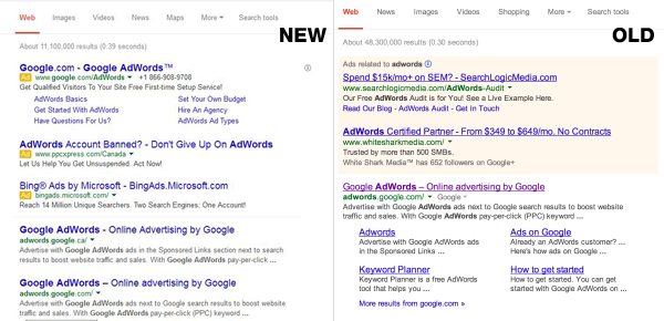
Google Adwords-Targeted Ads
The biggest change made is the way Google Adwords-Targeted Ads are displayed. The Pink shading has been removed & replaced by a small yellow box labeled “ad”. This change was first rolled out for ads to the mobile users in September. Google is trying to make the desktop & mobile experience unified.
Google’s lead design for Google Search, Jon Wiley, said on Google+, “you may have noticed that Google Search on desktop looks a little different today.” He goes on to explain how the underlines have been removed, the titles have larger font & the line heights have been evened out. Jon said this “improves readability and creates an overall cleaner look.”
What do you think about the new look? Do you find it easier to navigate & read through?